

A white dial leaves nowhere for a design to hide. Proportion becomes more visible, the rhythm of the markers grows clearer, and every hand must hold its place against the light. When those relationships are resolved, the result carries the quiet confidence of an object whose details no longer need explanation.
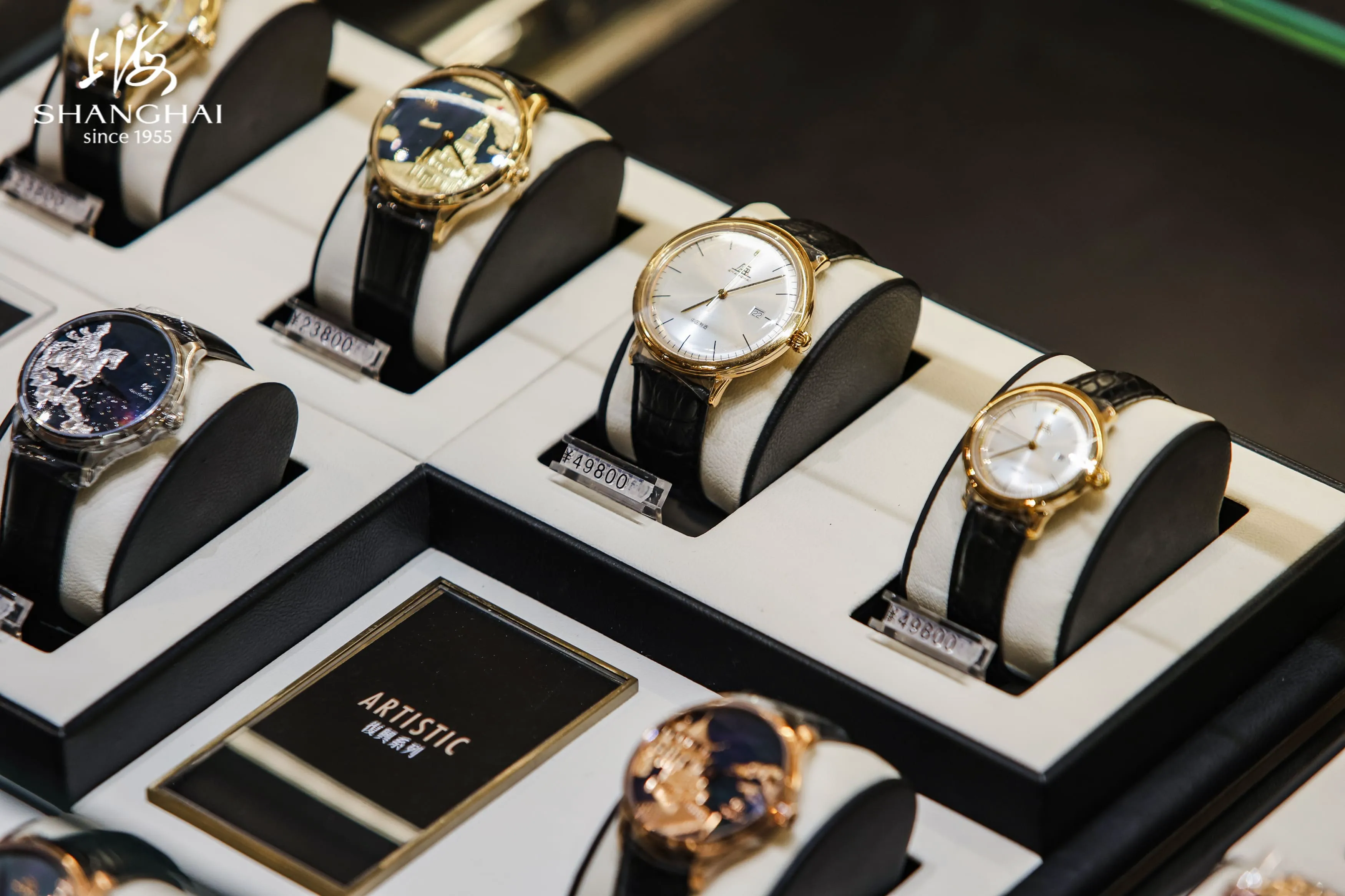
That clarity also makes white unusually expressive. One dial can feel compact and precise, another broad and formal, another purposeful enough to sit within a bezel-led sports design. The color remains constant; architecture, finish, and scale change the voice.
White Reveals Structure
Good legibility begins with contrast, but it is completed by order. Hands and markers should be immediately distinct, while the open areas of the dial give the eye somewhere to rest. A colored seconds hand can add animation, though its greatest effect comes when the surrounding composition remains disciplined.
The SHANGHAI Watch 50s White Sunburst Dial 31mm captures that economy. A light sunburst surface, red seconds hand, and date display are gathered within a compact 31 mm case. The proportions make every detail feel concentrated. Rather than commanding an outfit, the watch appears as a precise point of interest at the cuff.
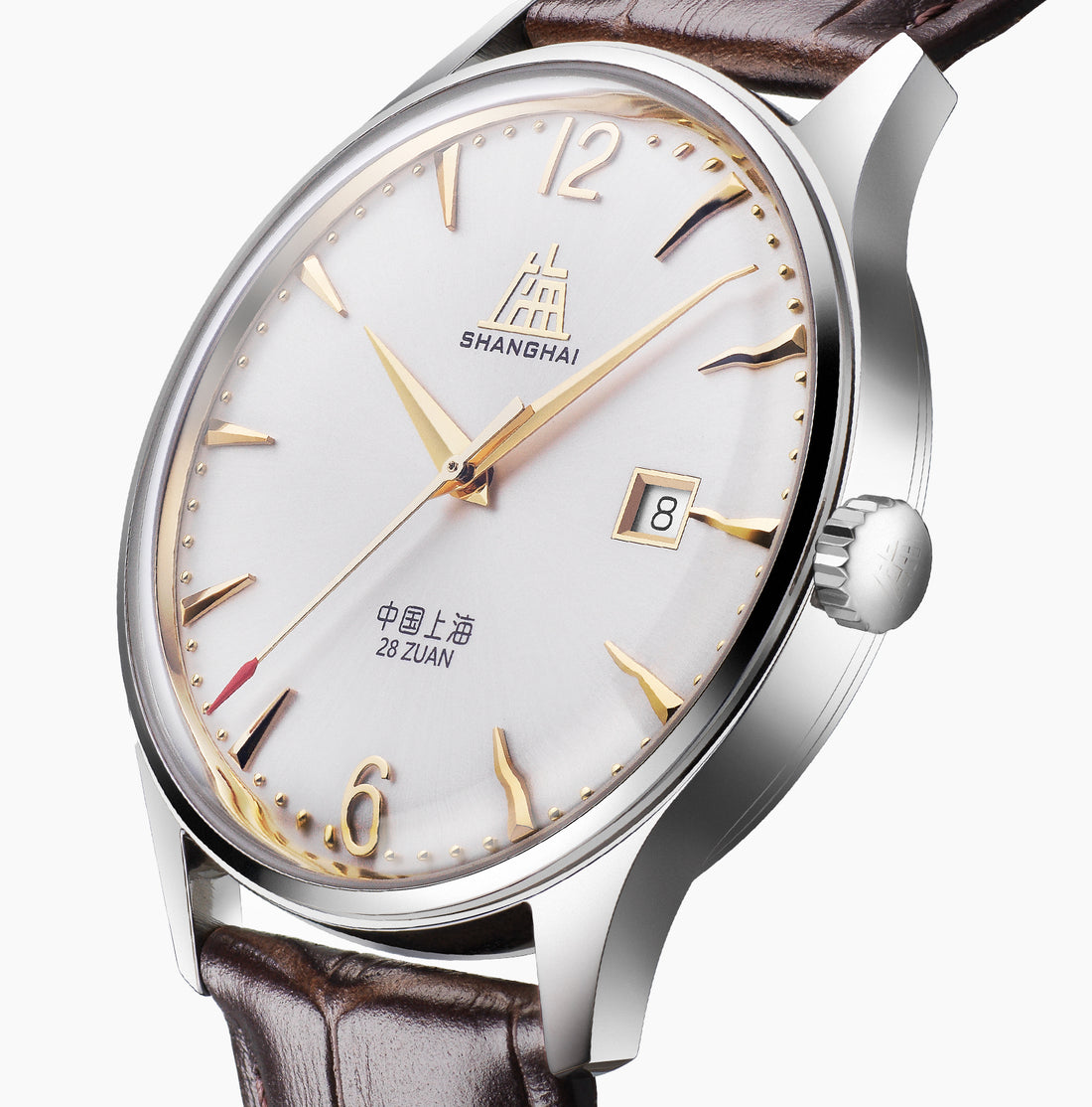
The SHANGHAI Watch 50s Light Sunburst Dial 39mm gives related design ideas more room. Its light dial, red seconds hand, and date retain the same sense of clarity, yet the larger format changes the visual cadence. Choosing between the two is less about convention than presence: one reads as an intimate detail, the other as a more open statement.
Light Gives the Surface Its Character
White names the color; finish determines its behavior. A smooth dial returns light evenly, a sunburst dial changes as the wrist turns, and a linear texture creates a quieter play of shadow. These differences determine whether the surface looks crisp, warm, graphic, or softly luminous.
This is why a white dial deserves to be seen from more than one angle. Near a window it can appear cool and exact. Under softer evening light, the same surface takes on greater warmth. Movement reveals details that a fixed photograph cannot: a fine reflection along a marker, the brief flash of a polished hand, the way texture emerges and recedes.
The finest effect is always controlled. When the dial carries visual energy, the hands and markers provide calm structure above it. When the dial is quiet, the case or bracelet can take a stronger role. Refinement comes from knowing where the eye should settle first.
Scale Changes the Mood
Diameter begins the conversation, but dial opening, bezel width, thickness, lugs, and attachment determine how the watch actually occupies the wrist. A pale surface often appears visually expansive, making those surrounding proportions especially important.
The 31 mm 50s reads like a concise sentence; the 39 mm version allows the same vocabulary to breathe. Each scale offers its own expression of elegance. The right one is the composition that remains balanced on the wrist, at a desk, and beneath the sleeve most often worn.
A different expression appears in the SHANGHAI Watch Business Classic 316L Steel White Dial 40mm. Its steel case and bracelet form a stronger architectural frame, while the day and date displays add information to the dial. The appeal lies in the order of the arrangement, where complication and serenity coexist because each element has a clear place.
Quiet with Strength
White dials are frequently placed in the dress-watch category, yet function comes from the surrounding architecture. The SHANGHAI Watch 114 Military White Sunburst 39mm presents a more technical character. Its white sunburst dial is joined by a date display, luminous wedge-shaped markers and hands, and a unidirectional ceramic bezel. The composition feels purposeful and direct.
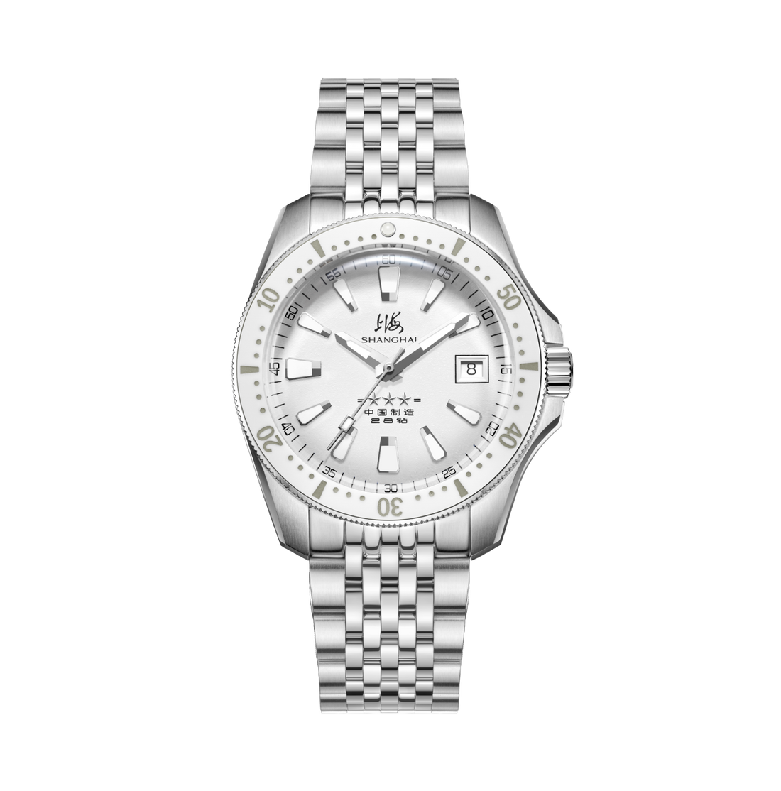
That contrast is central to the appeal of white. It can support a compact heritage-inspired watch, a business design with calendar information, or a bezel-framed sports watch. The surrounding structure decides whether the mood is restrained, formal, or instrumental.
Let the Wardrobe Supply the Frame
A white dial works beautifully with color because it leaves space for the surrounding palette. Navy makes it appear crisp; charcoal brings out its light; camel and brown give it warmth. With denim and a plain shirt, it looks direct. With dark tailoring, the very same dial acquires formality.
The attachment shifts the emphasis again. Brown leather brings softness and connects naturally with textured cloth. A steel bracelet extends the case into one clean line. A pronounced bezel gives the pale center definition and turns contrast into part of the watch's function. Exact color matching elsewhere in the outfit is unnecessary; the dial is strongest when given a clear frame.
Choose a white-dial watch by noticing what remains once color stops leading the decision: the authority of the hands, the cadence of the markers, the behavior of the surface, and the scale of the case. Quiet confidence is personality expressed through balance.
